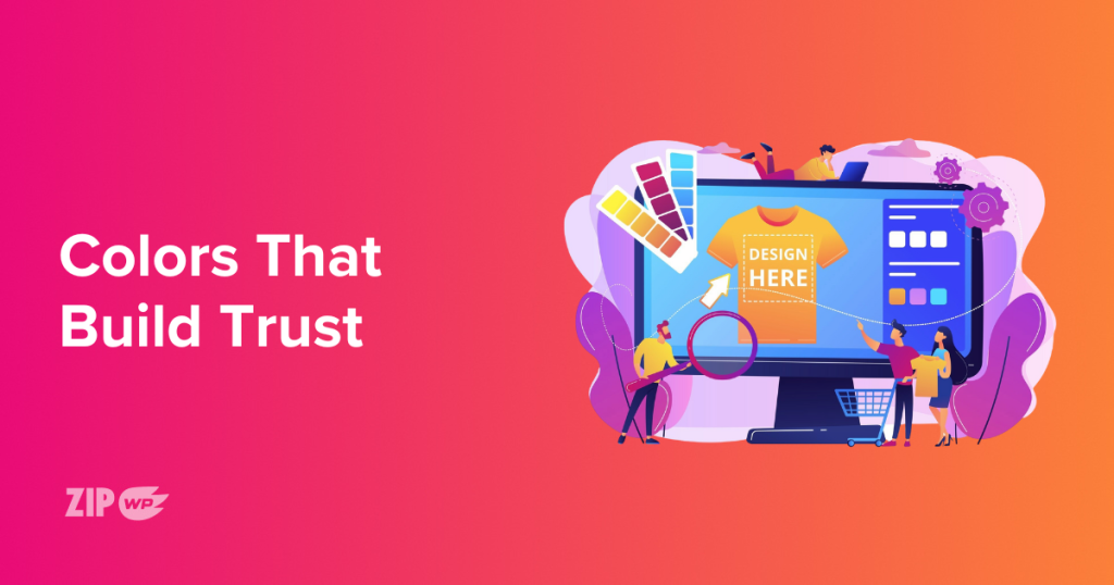
Before anyone reads a word on your website, they’re already sizing it up based on your color choices.
Are you giving off modern and clean, or bold and creative? Professional and polished, or fun and friendly? Colors do a lot of talking.
If you understand how to use color combinations on your website, you’re already ahead of most beginners.
In this post, you’ll explore 15 of the best color combinations for website design. We’ll break down why each palette works, how it connects to your brand’s personality, and when to use it.
You’ll also see how tools like ZipWP make it ridiculously easy to test and apply these color combos in seconds.
Ready to find the perfect look for your site? Let’s dive into the palettes.
- 15 Top Website Color Palettes
- 1. Navy Blue, White, and Gold
- 2. Charcoal, Mint Green, and Light Gray
- 3. Dark Purple, Soft Pink, and White
- 4. Deep Green, Beige, and Off-White
- 5. Sky Blue, Coral, and Light Gray
- 6. Classic Black, Red, and White
- 7. Olive, Mustard, and Cream
- 8. Teal, Orange, and Soft White
- 9. Slate, Cyan, and White
- 10. Rose, Dusty Blue, and White
- 11. Tangerine, Indigo, and Light Beige
- 12. Forest Green, Silver, and Off-White
- 13. Peach, Turquoise, and White
- 14. Crimson, Midnight Blue, and White
- 15. Monochrome: Multiple Grays and Black
- What Makes a Good Website Color Combination
- Color Psychology Cheat Sheet
- Do’s and Don’ts Quick List
- How ZipWP Makes It Easy
- Final Thoughts
- Best Color Combinations – FAQs
15 Top Website Color Palettes
Choosing the best color combination for website design is about communicating your brand, building trust, and making your content easy to read.
Below, you’ll find some of the best website color combinations that pair visual appeal with function.
1. Navy Blue, White, and Gold
- HEX: #1A1F71, #FFFFFF, #FFD700
- Vibe: Trustworthy, Elegant, Corporate
- Best for: Financial websites, law firms, consultants
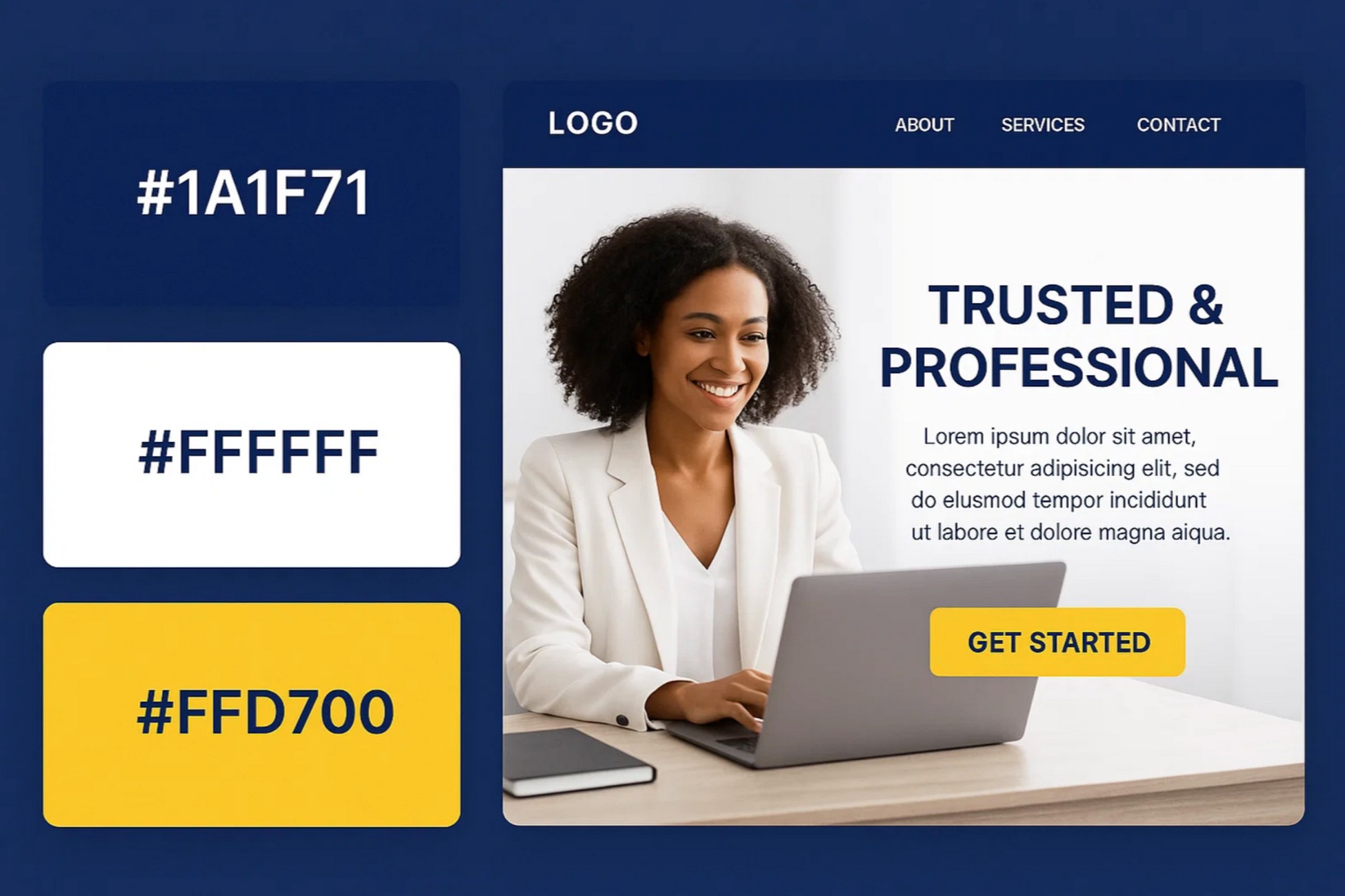
If you want your site to feel polished and credible, this trio is a classic. Navy blue builds trust, white keeps things clean, and gold adds just enough luxury.
Use it with minimal layouts and modern fonts to give your site a high-end look.
Mockup Tip: Try navy for your header, gold for CTA buttons, and white as your main background.
2. Charcoal, Mint Green, and Light Gray
- HEX: #333333, #A1E3D8, #F1F1F1
- Vibe: Calm, Clean, Modern
- Best for: SaaS tools, health startups, portfolios
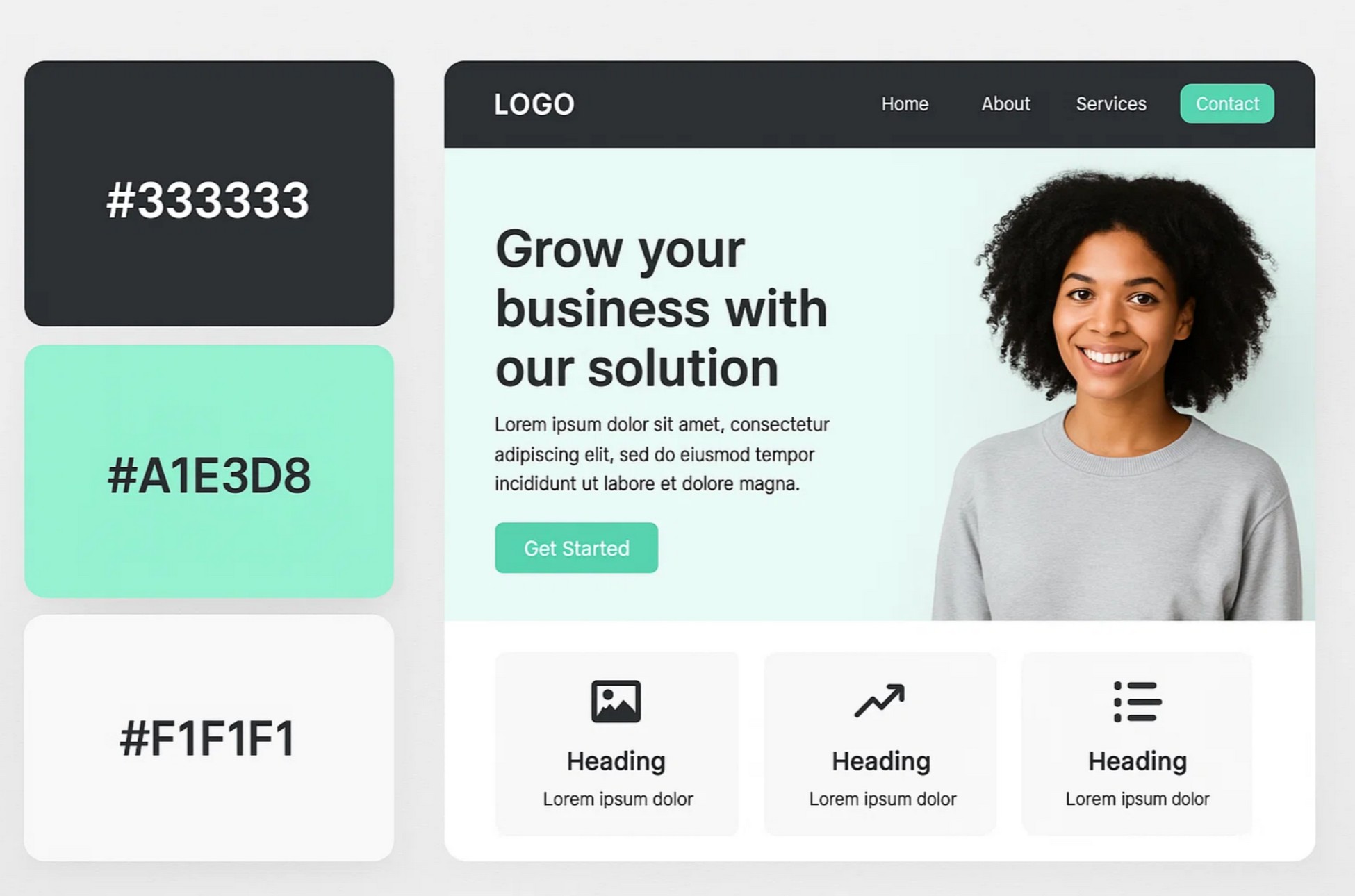
This color combination for website design brings clarity without feeling cold. Charcoal anchors the page, mint adds freshness, and light gray gives breathing room.
It’s perfect if you want a focused, user-friendly layout.
Mockup Tip: Use charcoal for navigation, mint for action buttons, and light gray for content areas or cards.
3. Dark Purple, Soft Pink, and White
- HEX: #2E003E, #FFB7C5, #FFFFFF
- Vibe: Creative, Feminine, High-contrast
- Best for: Personal brands, lifestyle blogs
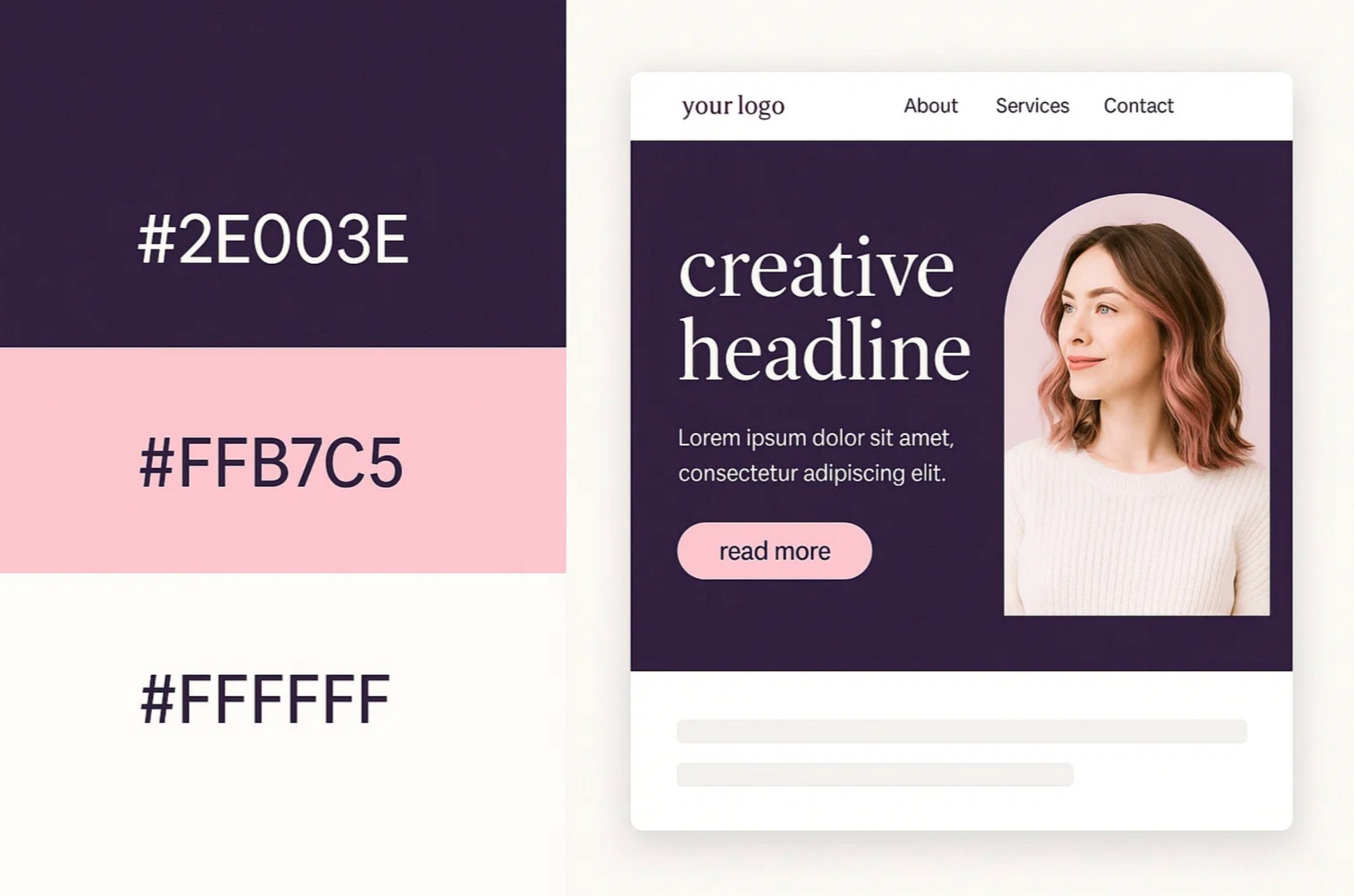
This palette mixes bold and soft in the right way. Dark purple feels rich and artistic, while soft pink adds warmth. It’s great for coaches or creators who want a stylish but inviting feel.
Mockup Tip: Use dark purple in your hero section, soft pink for buttons, and white to keep it bright and open.
4. Deep Green, Beige, and Off-White
- HEX: #014421, #F5F5DC, #FAFAFA
- Vibe: Organic, Minimalist, Authentic
- Best for: Eco shops, wellness brands, interior design
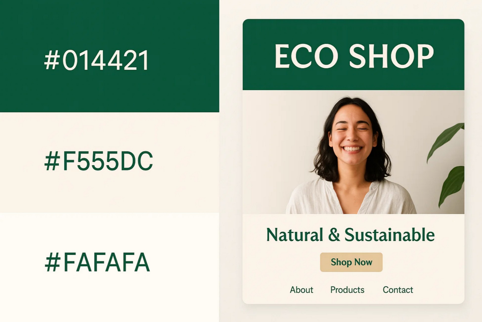
This is one of the most grounded website color combinations. Deep green brings calm, beige softens the layout, and off-white ensures clarity.
Great for brands that care about sustainability and simplicity.
Mockup Tip: Use green in headers, beige for primary buttons, and off-white for the content background.
5. Sky Blue, Coral, and Light Gray
- HEX: #00AEEF, #FF6B6B, #ECECEC
- Vibe: Friendly, Energetic, Approachable
- Best for: Ecommerce, event sites, tech startups
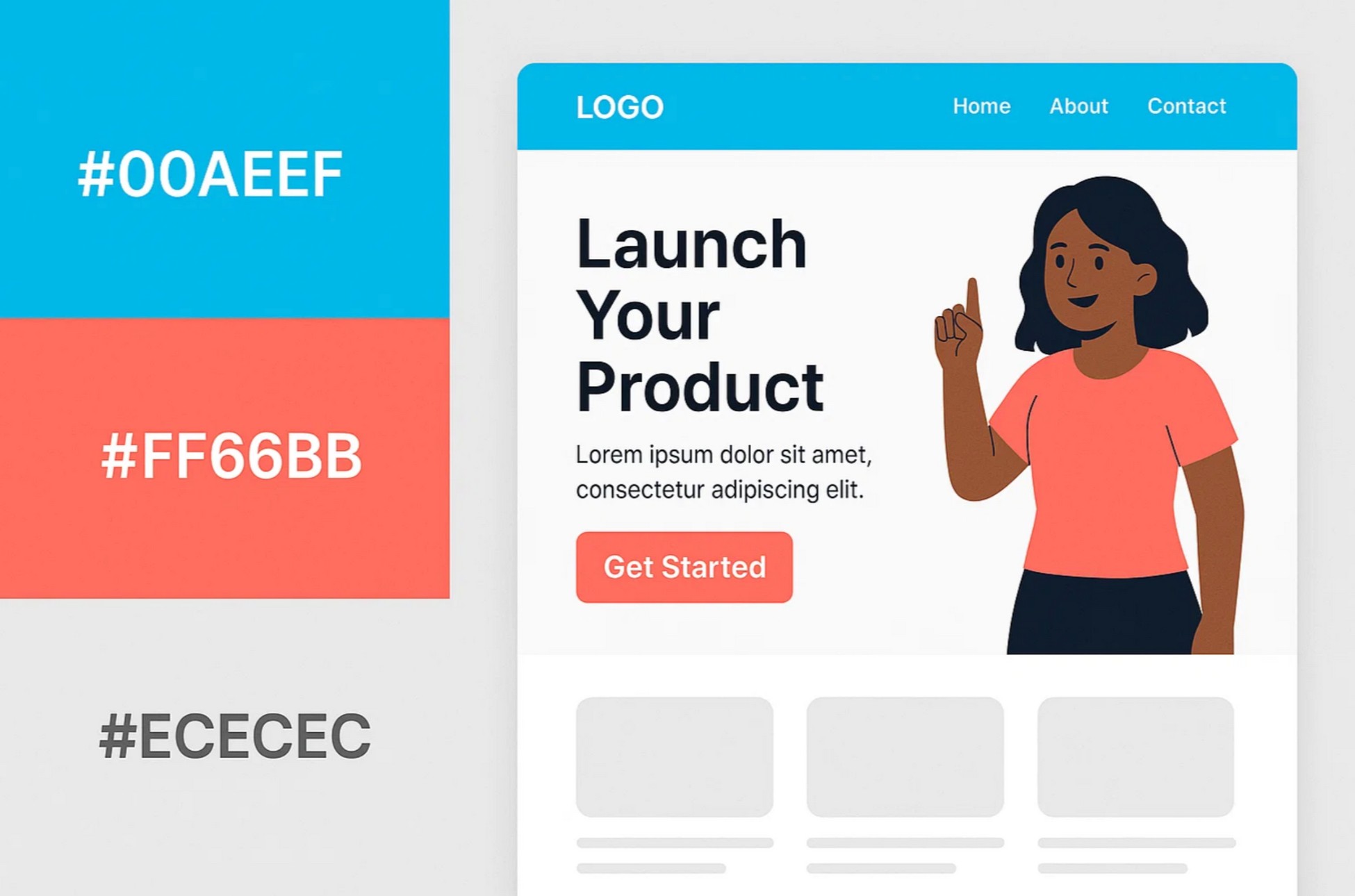
This one’s bold but balanced. Sky blue creates trust, coral draws attention, and light gray keeps it usable. Ideal for product launches or modern service sites.
Mockup Tip: Sky blue headers, coral CTAs, and light gray sections work beautifully together.
6. Classic Black, Red, and White
- HEX: #000000, #FF0000, #FFFFFF
- Vibe: Bold, Assertive, High-impact
- Best for: Fashion, gaming, digital launches
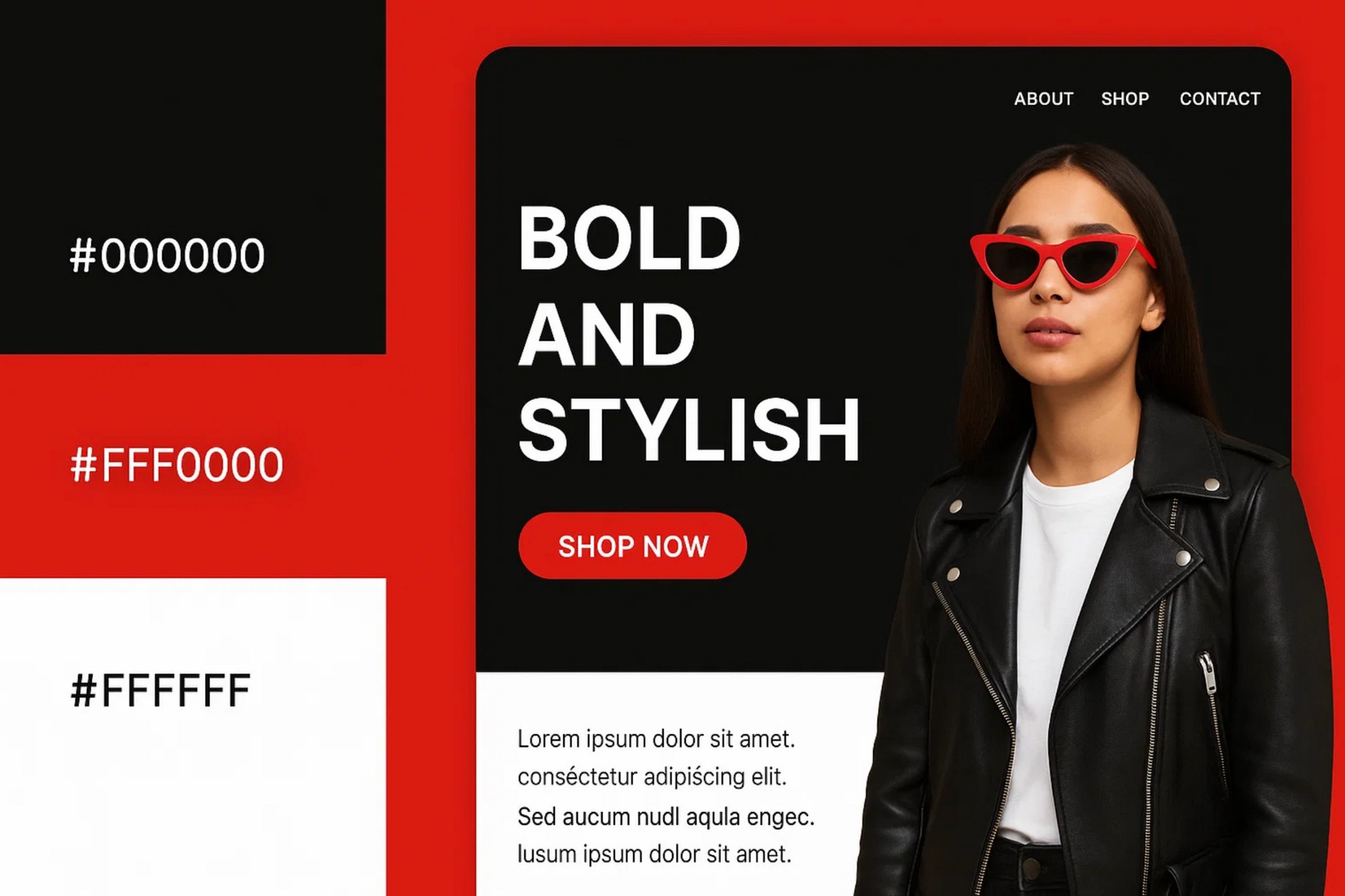
This web design color combination is all about confidence. Black is sleek, red grabs attention, and white keeps it readable. Great for brands that want to stand out.
Mockup Tip: Try a black hero, red CTA, and white for body content.
7. Olive, Mustard, and Cream
- HEX: #556B2F, #FFDB58, #FFFDD0
- Vibe: Retro, Warm, Nostalgic
- Best for: Handmade products, blogs, storytelling sites
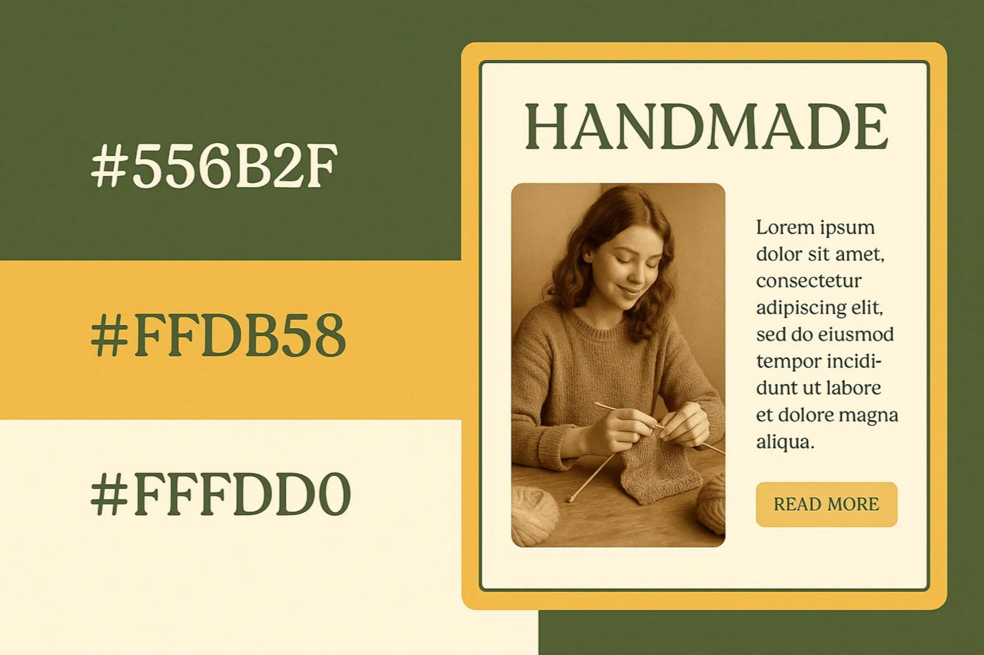
Olive and mustard give vintage charm, while cream makes everything feel soft. This combo works well if your brand has a tactile or personal feel.
Mockup Tip: Use olive in borders, mustard for CTAs, and cream backgrounds with serif fonts.
8. Teal, Orange, and Soft White
- HEX: #008080, #FFA500, #FDFDFD
- Vibe: Balanced, Bright, Unique
- Best for: Travel sites, agencies, media companies
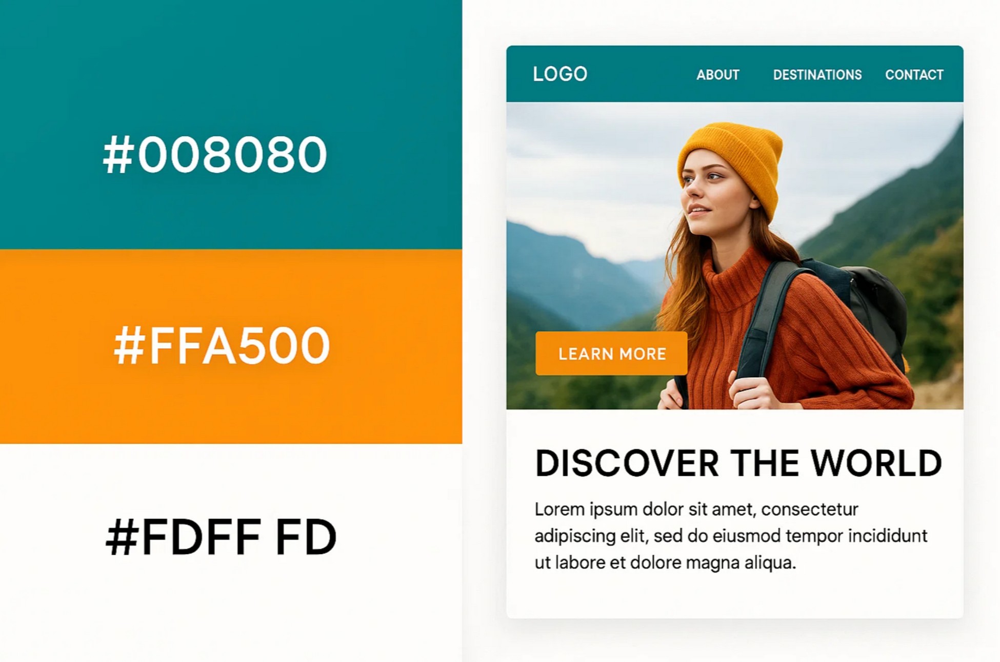
Teal and orange balance calm and energy, while soft white keeps it grounded. This palette is perfect if you want to look bold without being loud.
Mockup Tip: Teal for navigation, orange for highlights, and white for content blocks.
9. Slate, Cyan, and White
- HEX: #2F4F4F, #00FFFF, #FFFFFF
- Vibe: Clean, Modern, Technical
- Best for: Tech startups, SaaS platforms, UX portfolios
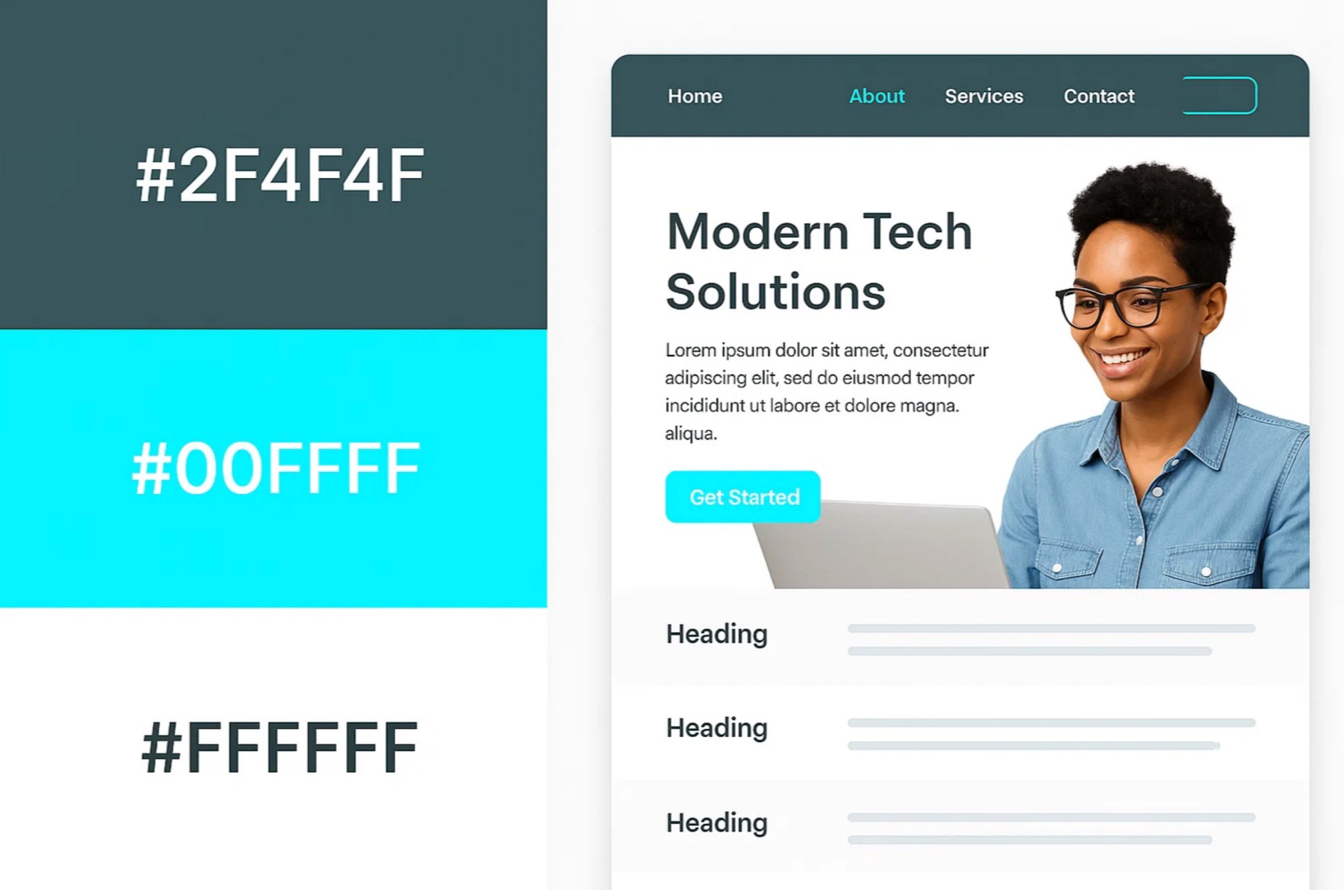
This is one of the best website color combinations for tech. Slate is professional, cyan adds freshness, and white keeps it easy to navigate.
Mockup Tip: Try slate headers, cyan hover effects, and white content rows.
10. Rose, Dusty Blue, and White
- HEX: #F7CAC9, #92A8D1, #FFFFFF
- Vibe: Soft, Romantic, Elegant
- Best for: Creatives, wedding services, coaches

This pastel trio is all about feeling. Rose adds charm, dusty blue brings peace, and white balances the page. Use it if your brand is heartfelt or emotional.
Mockup Tip: Rose for headers, dusty blue for buttons, and white backgrounds for a clean layout.
11. Tangerine, Indigo, and Light Beige
- HEX: #FF8C00, #4B0082, #FAF3E0
- Vibe: Bold, Artistic, Expressive
- Best for: Agencies, creators, event pages
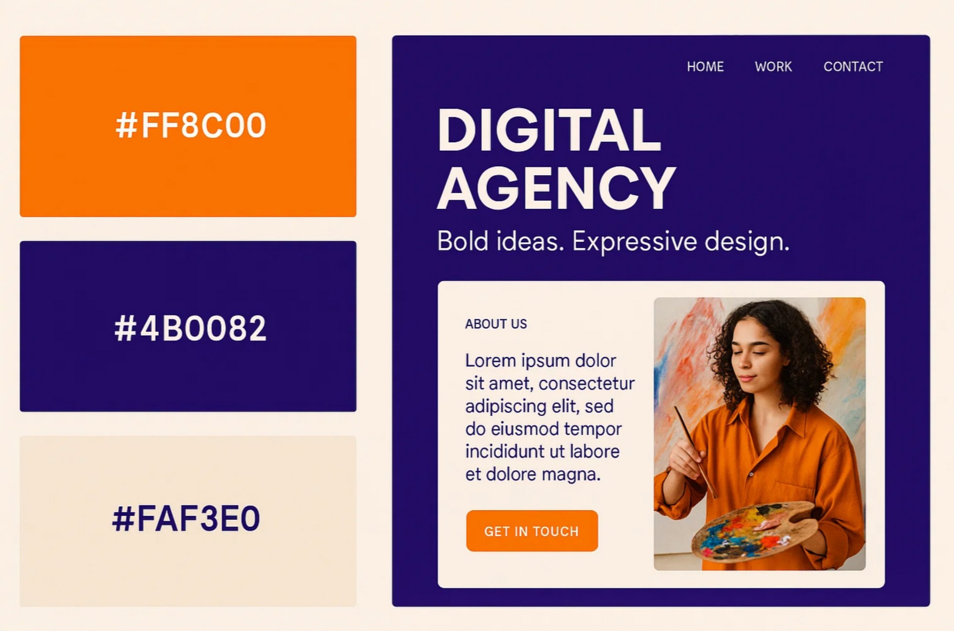
This combo is pure personality. Tangerine grabs the spotlight, indigo adds depth, and beige keeps it balanced. It’s great for sites like a digital agency or an events company with flair.
Mockup Tip: Use indigo in your hero section, tangerine for buttons or banners, and beige as the backdrop for text and content cards.
12. Forest Green, Silver, and Off-White
- HEX: #228B22, #C0C0C0, #FAFAFA
- Vibe: Smart, Understated, Professional
- Best for: Architecture, landscaping, B2B
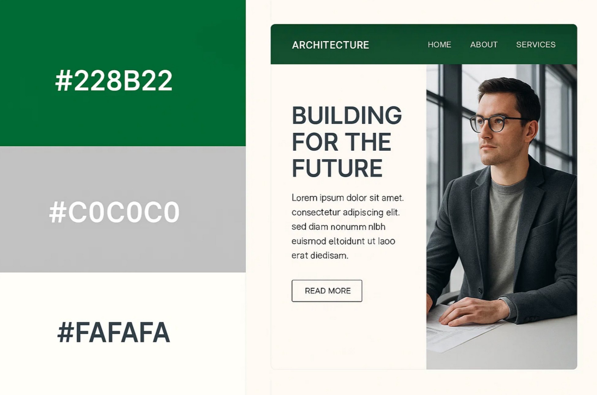
Forest green is confident but not flashy, silver adds a tech-savvy edge, and off-white keeps the space clean. It’s a natural fit for professional services and modern corporate sites.
Mockup Tip: Forest green navigation, silver headlines or icons, and off-white body content keep everything polished and approachable.
13. Peach, Turquoise, and White
- HEX: #FFDAB9, #40E0D0, #FFFFFF
- Vibe: Light, Fun, Inviting
- Best for: Kids products, lifestyle brands, DTC
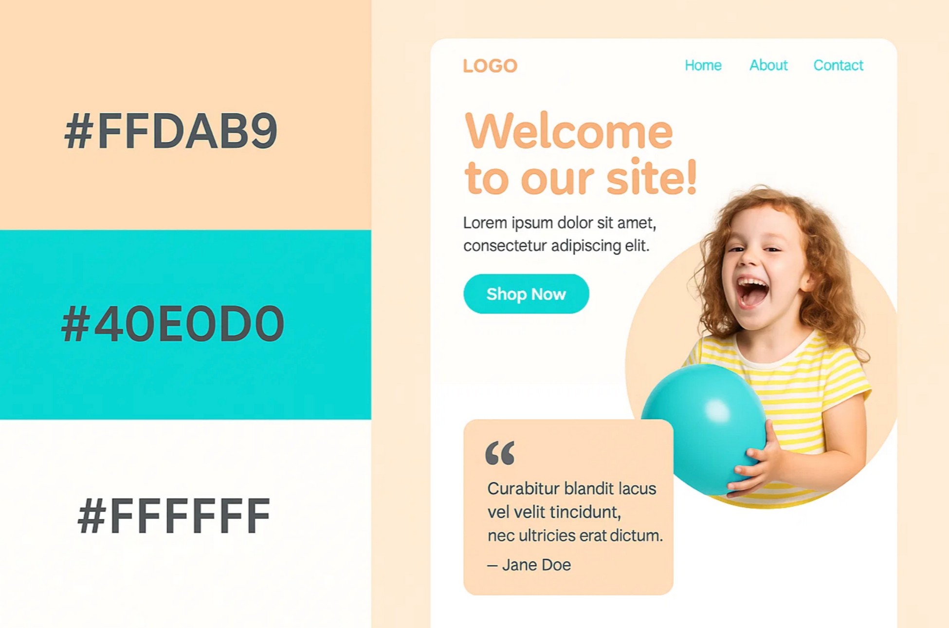
This cheerful palette feels like a sunny day. Peach is warm and friendly, turquoise adds a splash of fun, and white keeps it all grounded. It’s perfect for playful brands or online stores aimed at a younger audience.
Mockup Tip: Use white backgrounds, turquoise CTAs, and peach accents on sections like testimonials or product highlights.
14. Crimson, Midnight Blue, and White
- HEX: #DC143C, #191970, #FFFFFF
- Vibe: Bold, Heroic, Impactful
- Best for: Campaigns, sports, fundraising sites
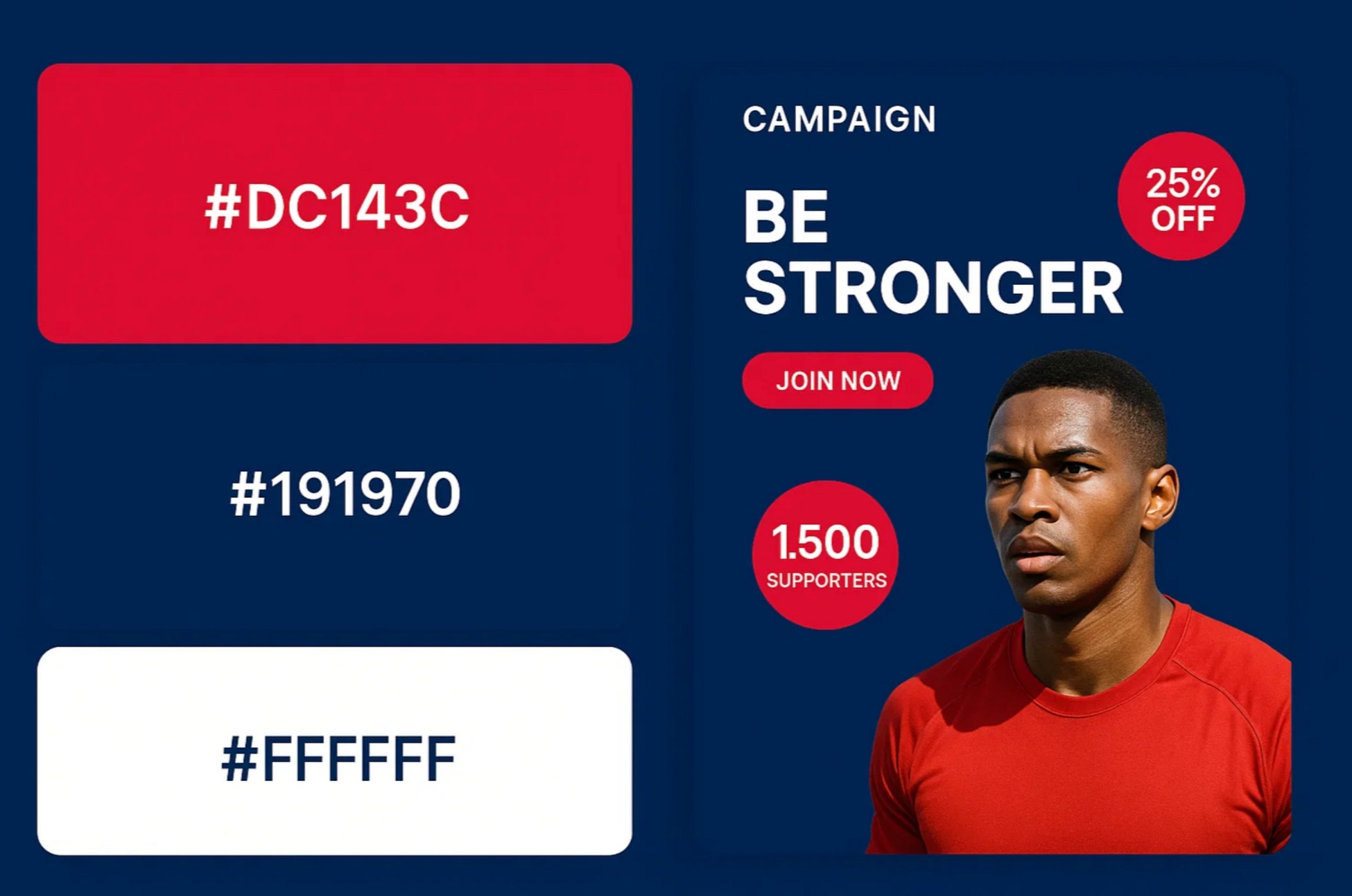
It’s a powerful combo for websites that want to inspire action or energy, especially around sports or causes. If your site is about rallying support or creating excitement, this is a solid option.
Mockup Tip: Go with a midnight blue background, white text, and crimson CTAs. Highlight key stats or calls-to-action using red badges or accents.
15. Monochrome: Multiple Grays and Black
- HEX: #F5F5F5, #B0B0B0, #000000
- Vibe: Minimal, Sleek, Editorial
- Best for: Portfolios, editorial blogs, product reveal
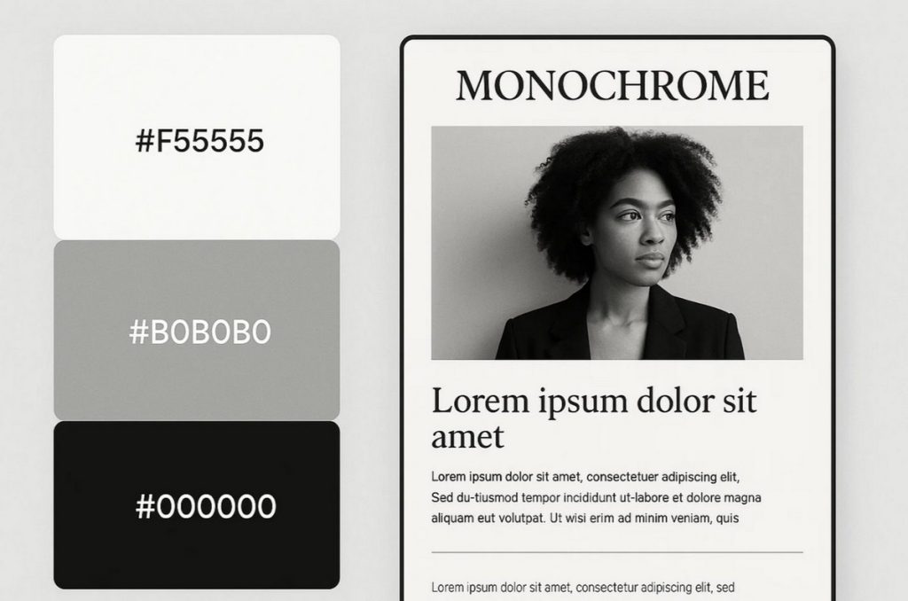
Monochrome will never go out of style. Shades of gray combined with deep black let your content do the talking. It’s a go-to for creators, product designers, or visual storytellers who want a clean canvas.
Mockup Tip: Light gray for the background, black headers, and medium gray body text. Add thin dividers or shadows to create a modern, spacious layout.
What Makes a Good Website Color Combination
Picking the best color combination for your website is about using color with purpose. Here’s what to focus on when choosing your website color scheme:
- Contrast and visual hierarchy: Dark text on a light background (or the other way around) keeps things clean and scannable. Your buttons and headlines should stand out, not blend in.
- Brand alignment: A luxury brand? Go for navy and gold. Wellness or eco-focused? Soft greens and earth tones usually work well. Match the tone, not just the trend.
- Audience expectations: Bold, bright colors often resonate. Targeting professionals or older users? Stick to softer, muted tones. Your website color combination should meet your audience where they are.
- Accessibility: Not everyone sees color the same way. Use tools like WebAIM’s Contrast Checker to make sure your text has enough contrast. It’s not just best practice, it’s inclusive design.
- Color balance: Stick with three key players: a dominant color, a supporting color, and an accent. That balance helps avoid visual clutter and gives your layout a clear, intentional feel.
A strong color scheme does more than just make your site look good. It helps create a smoother user experience and can even influence your SEO and how visitors behave on your site. Want to see how it all connects? Take a look at this guide on web design and SEO.
Color Psychology Cheat Sheet
Not sure where to start with your website color scheme? Use this cheat sheet to match the mood you want to create with the colors that support it.
| Color | Mood | Best For |
|---|---|---|
| 🔵 Blue | Trust, stability, calm | Finance, healthcare, tech companies |
| 🔴 Red | Passion, urgency, energy | Sales pages, gaming, food brands |
| 🟢 Green | Growth, balance, wellness | Eco-friendly brands, health sites |
| 🟡 Yellow | Optimism, creativity, warmth | Agencies, lifestyle brands, food |
| 🟣 Purple | Luxury, creativity, depth | Beauty, fashion, spiritual content |
| ⚫ Black | Bold, modern, elegant | Luxury brands, editorial content, fashion |
| ⚪ White | Clean, open, simple | Any niche |
| 🩷 Pink | Soft, caring, expressive | Personal brands, wellness coaches, beauty |
| 🟠 Orange | Energetic, confident, fun | E-commerce, creative services, youth brands |
| 🟤 Gray | Neutral, stable, polished | SaaS, B2B, modern portfolios |
Use this cheat sheet as a guide and you’ll be surprised how much more effective your site feels when the color fits the message.
New to the game? Here’s a helpful starter guide for becoming a freelance web designer.
Do’s and Don’ts Quick List
Even the best color combinations for website design can fall flat if they’re used without intention. Here’s a quick cheat sheet to help you get it right:
| ✅ Do | ❌ Don’t |
|---|---|
| Base your palette on your brand tone | Use near-identical shades for key elements |
| Ensure strong contrast for CTAs | Overuse vibrant colors without balance |
| Test colors on different devices and screens | Ignore accessibility for color-blind users |
When you choose the right website color combination and apply it thoughtfully, your site feels more intentional, professional, and user-friendly.
How ZipWP Makes It Easy
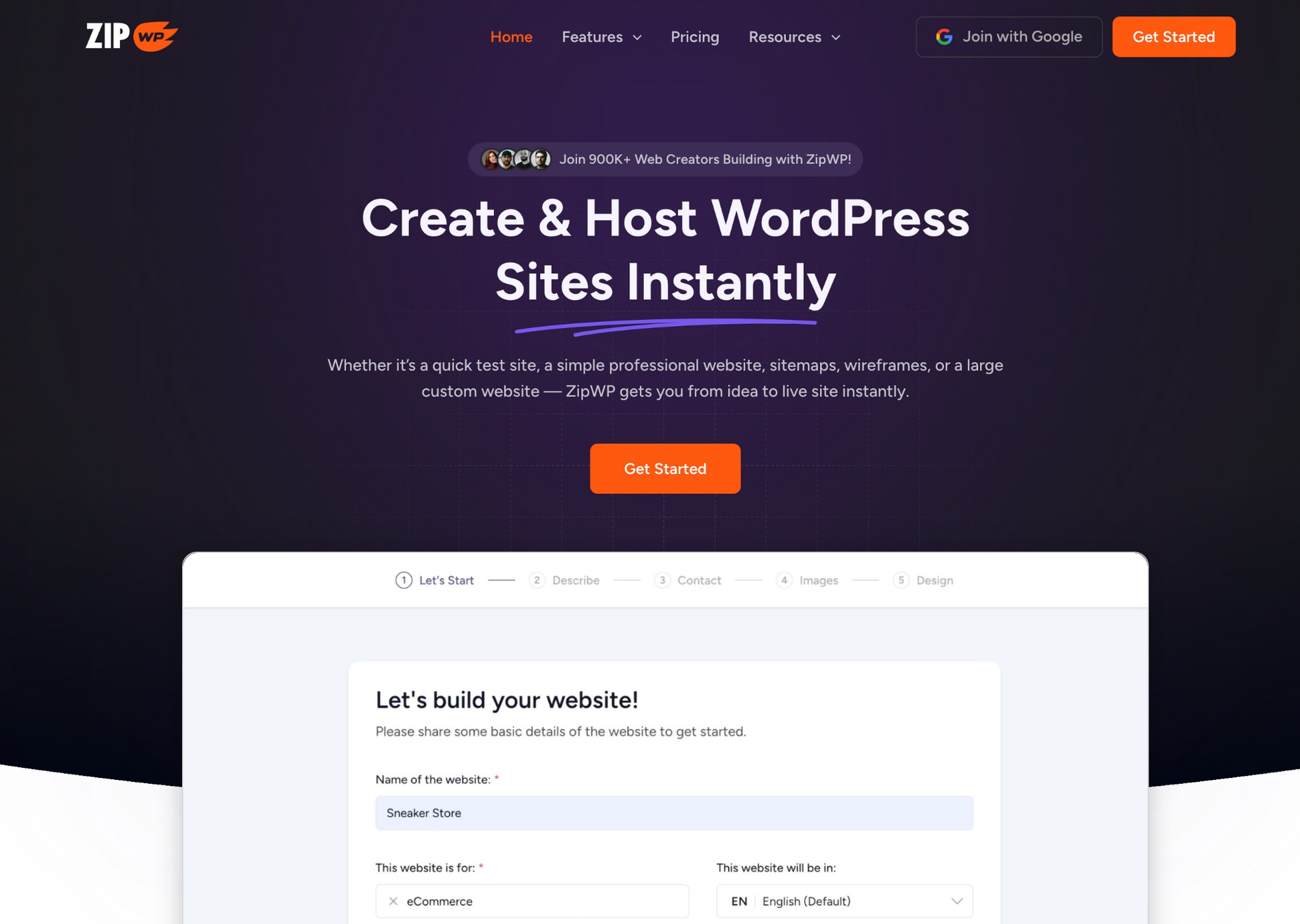
Picking the right website color combination can feel overwhelming, especially if you’re not a designer. That’s where ZipWP steps in to make things simple, fast, and frustration-free.
Adaptive Patterns Library
Instead of starting from scratch, you can choose a layout that fits your brand personality and instantly apply a color palette that’s already been tested to work.
AI Website Builder
Tell ZipWP your niche, like ecommerce, coaching, or SaaS, and it suggests color combinations that match your industry vibe. It’s like having a smart designer at your side who knows what works.
Try Before You Commit
Head to Try.new to spin up a preview site in seconds. Play with different palettes, see what feels right, and tweak it live before going all in.
With ZipWP, you can create a professional-looking website that feels totally on-brand without spending hours on color theory or layout design.
Here’s a glimpse of how you can play with color palettes with ZipWP:

Want a full walkthrough? This ZipWP AI guide shows you everything step-by-step.
Final Thoughts
Choosing the best color combination for your website doesn’t have to be complicated.
The right colors set the tone before visitors read a word, whether you’re aiming for bold, calming, fun, or professional.
Start with the best color combinations for website design shared in this post. Test a few palettes to see which one fits your brand and audience best.
And if you want to speed things up, ZipWP makes it easy. Its smart AI builder helps you apply the perfect website color scheme in seconds.
Head over to Try.new, preview your design, and build a site that looks like it came from a pro, without the guesswork.
Best Color Combinations – FAQs
Join 931,900 Subscribers
Disclosure: This blog may contain affiliate links. If you make a purchase through one of these links, we may receive a small commission. Rest assured that we only recommend products that we have personally used and believe will add value to our readers. Thanks for your support!
Recommended Articles
Empower Your Influence & Content With ZipWP Blueprints!
Let People Test Drive Your WordPress Products with ZipWP Blueprints!